
Platform
Reading your dashboard
All nine panels on the teacher home — the question each answers, what its number means, and what to do about it.
My Classes is nine small panels. Each one answers a question you would otherwise have to ask thirty children individually. This page takes them one at a time.
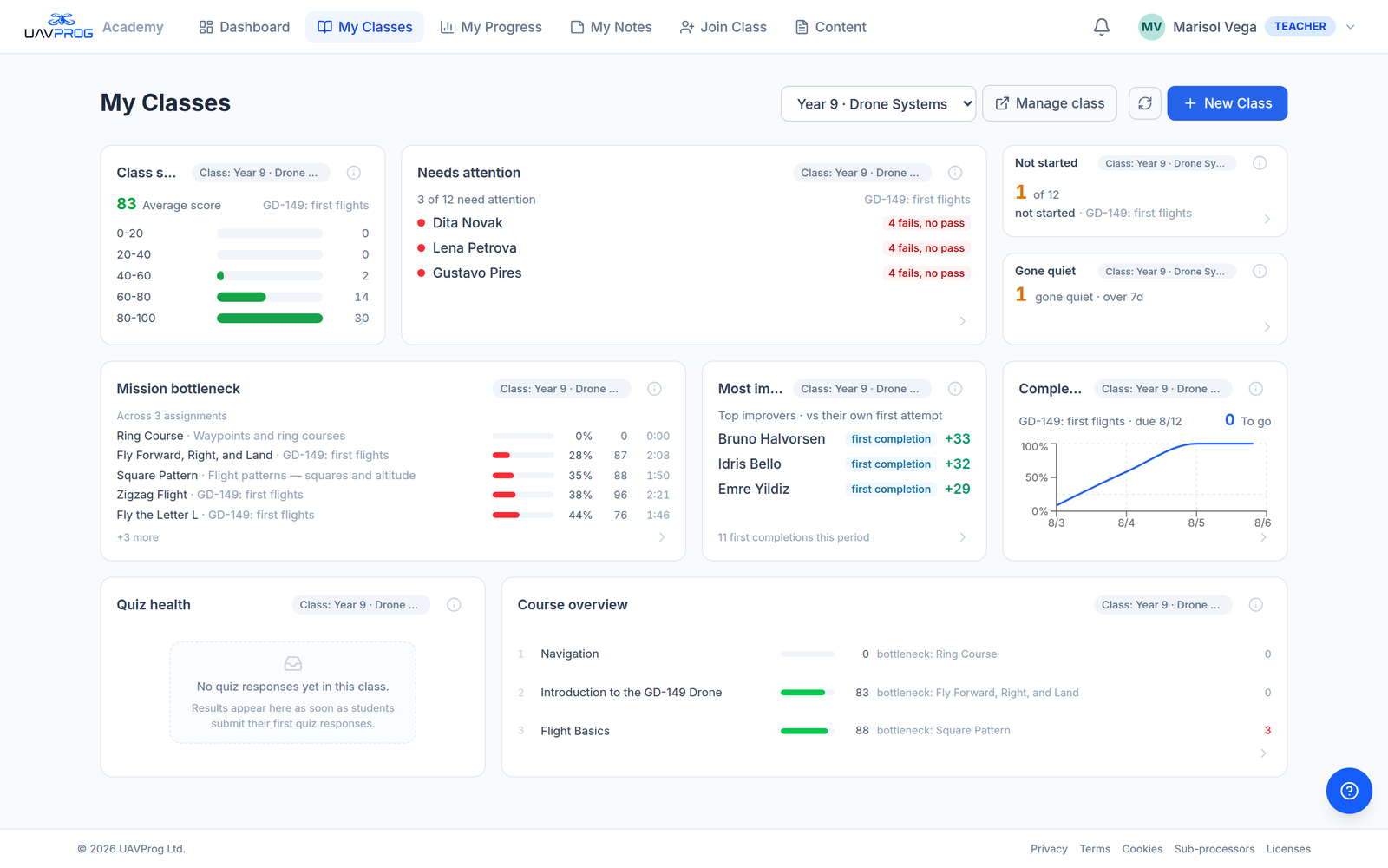
The whole board. Panels are sized by how often you need them: the ones that name people are large, the ones that are a single number are small.
Three things to know before you read any of them
One class at a time. The dropdown at the top of the page is in charge. Every panel follows it, and each panel repeats the class name in a small grey chip so you can never misread one class’s numbers as another’s.
One assignment at a time — chosen for you. Four panels measure a single assignment: Class score distribution, Needs attention, Not started and Completion trend. You do not pick it. Each one takes the assignment whose deadline is nearest in the future, or — if every deadline has passed — the one that was due most recently, and only ever among the assignments you have actually published. It then names its choice in small grey text: “GD-149: first flights”.
If a panel is showing something you did not expect, read that line first. It is telling you what it decided to look at. You can override it from the panel’s larger view, under Options → Assignment.
The other five are not scoped that way. Mission bottleneck deliberately ranks across all of the class’s assignments at once, so the worst mission surfaces without you cycling through them. Quiz health hunts for the lowest-scoring quiz in the class. Gone quiet, Most improved and Course overview are about the class as a whole.
Every panel explains itself. The small ⓘ in the corner opens a larger version with the full list, buttons that do something useful, and — at the bottom — a plain-English paragraph headed What this means. That paragraph is maintained by the people who built the panel. If this page and that paragraph ever disagree, believe the product.
Who needs me right now
Which panel answers which question.
The three panels that name individual children. If you read nothing else before a lesson, read these.
Needs attention
The question: which of my students is in trouble on the current assignment?
What it shows: “3 of 12 need attention”, then the names, each tagged with the reason. Open it and the names group under the reason, with the rule spelled out underneath.
There is no risk score and no algorithm making a judgement about a child. Each flag is a rule you could check by hand:
| The tag | What it means exactly |
|---|---|
| at cap, below pass | They have used every attempt the assignment allows and still have not passed. They are stuck and cannot get themselves unstuck — only you can. |
| 4 fails, no pass | Three or more attempts on one mission, never passed. The number shown is their actual attempt count. |
| not started · due in 2d | No attempt at anything in this assignment, and the deadline is within three days. |
| late ×2 | They submitted this many missions after the due date. |
What to do: at cap is the urgent one — that child is blocked and will stay blocked until you act. Give them more attempts (how) or sit with them. Repeated fails usually means they have misunderstood something rather than that they are careless; open their page and look at the code they wrote.
The big view has a Nudge these students button that sends a short in-app message to everyone currently flagged, in one press. It asks for confirmation first. A student who has turned off lab notifications will not receive it, and the result tells you how many were skipped.
Not started
The question: who has not begun?
What it shows: a number out of the class size — “1 of 12” — and, in the big view, exactly who, with the date each joined and when they were last active.
What to do: this is the cheapest intervention in teaching and the one most likely to work. A student who has not started three days before a deadline will usually still hand something in if you say their name on Tuesday. The big view has Copy names for pasting into whatever you use to message them, and a link back to the class if you want to push the deadline for everybody instead.
Gone quiet
The question: who has quietly stopped?
What it shows: how many students have done no work on this class in more than seven days, stalest first.
This is a different question from “not started”. Not-started is about one piece of work; gone-quiet is about the student. It is the earliest warning you get that someone is drifting away, and it is deliberately based on work, not on logging in — signing in and staring at a screen is not progress.
Watch for the small active elsewhere tag. It means that student has been using the platform recently — practising on their own, or working in another class — just not on yours. That is a very different conversation from a child who has vanished completely, so the panel refuses to lump them together.
What to do: the big view offers Copy re-engagement message — a pre-written, friendly paragraph you can send. Edit it to sound like you.
What is the class finding hard
Class score distribution
The question: how did the class do, and is the average hiding anything?
What it shows: the big number is the class average on the current assignment. Below it, every student’s best score sorted into five bands.
The shape matters more than the average. Two classes can both average 60:
What to do: a heavy left-hand tail means reteach before you move on. A split means split the room. The big view names the struggling students and has a button through to Needs attention so you go straight from “there is a problem” to “here is who”.
It also has Export grades (CSV) if you want the raw numbers.
Mission bottleneck
The question: which single mission is the class stuck on?
What it shows: every mission across all of this class’s assignments, ranked worst first by the share of students who finished it. The bar is colour-coded:
- red — under 50% finished. This is where the class is stuck.
- yellow — 50% to 80%. Shaky.
- green — over 80%. Landing well.
Next to each are the average score and the average time.
The trick is to read completion and score together. A mission where only 28% finished but the ones who did averaged 87 is not too hard — it is too long, or they ran out of attempts, or it is unclear what is being asked. A mission where 60% finished and they averaged 45 is genuinely difficult. Those need different responses, and this is the only panel that lets you tell them apart.
What to do: if one mission is red and the rest are green, teach that one thing to the whole room. The big view links to the course editor if the mission itself needs rewriting, and can copy the list of students still stuck on it.
Quiz health
The question: which quiz did the class misunderstand, and what did they believe instead?
What it shows: the panel compares your class’s quizzes, picks the one with the lowest average, and shows its hardest questions worst-first. For each hard question it also names the single wrong answer most students chose.
That last detail is the useful one. Knowing that 40% got question 3 wrong tells you to reteach it. Knowing that 40% all chose the same wrong answer tells you what they actually believe, which is what you reteach.
What to do: teach against the wrong answer, not the right one. The big view has Build reteach set, which collects the worst questions for you.
The panel sits empty until somebody answers a quiz, and says so plainly.
Is it going well
Completion trend
The question: will they finish in time?
What it shows: the share of the class that has completed the assignment, day by day, climbing towards the deadline. The dashed marker is the due date. Beside it, To go — how many students still have not finished.
How to read it: if the line is well below the top as it approaches the marker, that gap is the number of children who will miss the deadline. You can see it coming several days out, which is the whole point of the panel.
What to do: the big view has a reminder action for the ones still outstanding.
Most improved
The question: who deserves to be told they are doing well?
What it shows: the students who improved the most against their own first attempt over the last month — best score minus first score. Alongside that, first-ever completions and streak milestones.
This is deliberately not a leaderboard. It does not rank children against each other, because ranking children against each other reliably demoralises the bottom half. A child who went from 20 to 55 has done something more impressive than a child who scored 95 both times, and this panel is the one that notices.
Look at the coverage note at the bottom of the big view: “These students received no teacher feedback this period.” That is a list of the children you have not said anything to. It exists because praise, left to itself, goes to the same three students every week.
What to do: say something. The big view has a praise message you can copy; better still, open their page and write feedback there, which they will see attached to the actual piece of work.
Course overview
The question: across everything this class is doing, what is hardest — and why?
What it shows: every course the class has been assigned, ranked by average score with the lowest first. The score bar is red under 50, yellow 50–80, green above 80. Then a “Why it’s hard” column naming the worst single signal the panel found:
- bottleneck: mission name — most of the class cannot finish that mission.
- quiz: lesson name — they failed that lesson’s quiz.
- confusion: block 4 — students marked that part of the lesson text as confusing while reading it. (Only the count of markers, never who or what they wrote — see What you cannot see, and why.)
What to do: this is the panel for planning next week rather than today. Use it to decide which course needs a lesson rebuilt, then drill in for detail.
The Progress tab, when you want the detail
The dashboard summarises. When you want the actual grid — every student against every mission — open the class and stay on Progress.
The progress grid. One row per student, one column per mission.
Each cell is that student’s best score, with their number of attempts in
brackets. 0 (4) means four goes and nothing to show for it — the single most
useful pattern on the whole page. A dash means they have not tried it.
Beside some names you will see a triangle (struggling) or a small Top 10% / Bottom 25% badge. The bottom row averages each mission down the column, which is a quick way to spot the one everybody found hard.
Above the grid: completion, average score, average time, how many are struggling, the score distribution, the completion trend, and a card per mission tinted red, yellow or green. Below it, clicking any student’s name opens their page.
The whole tab refreshes itself every thirty seconds. It is designed to be left open on a second screen while the class works.
When a panel is empty
An empty panel is usually correct, and it usually says why. “Everyone is on track”, “No quiz responses yet in this class”, “Everyone has started this assignment”. Read the sentence — an empty Needs attention is good news.
If a panel is empty and you think it should not be, check in this order:
- Is the right class selected in the dropdown at the top?
- Which assignment is it showing? The small grey label under the title.
- Is that assignment published? Drafts are invisible to panels, exactly as they are invisible to students.
- Has anybody actually attempted anything yet? Most panels need at least one attempt to have something to say.
Next
→ Looking at one student — the panels tell you a name; this is what to do once you have it.